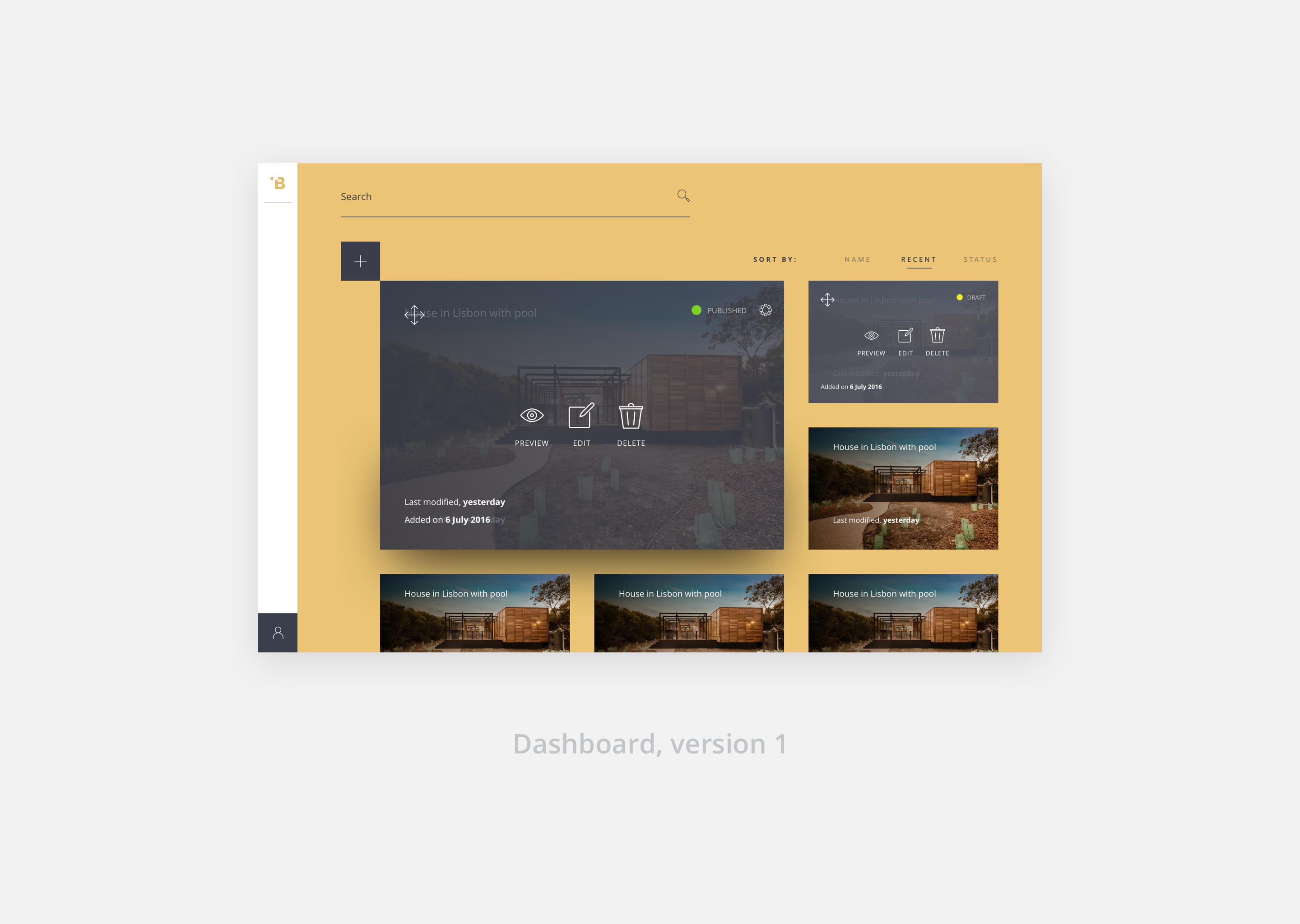
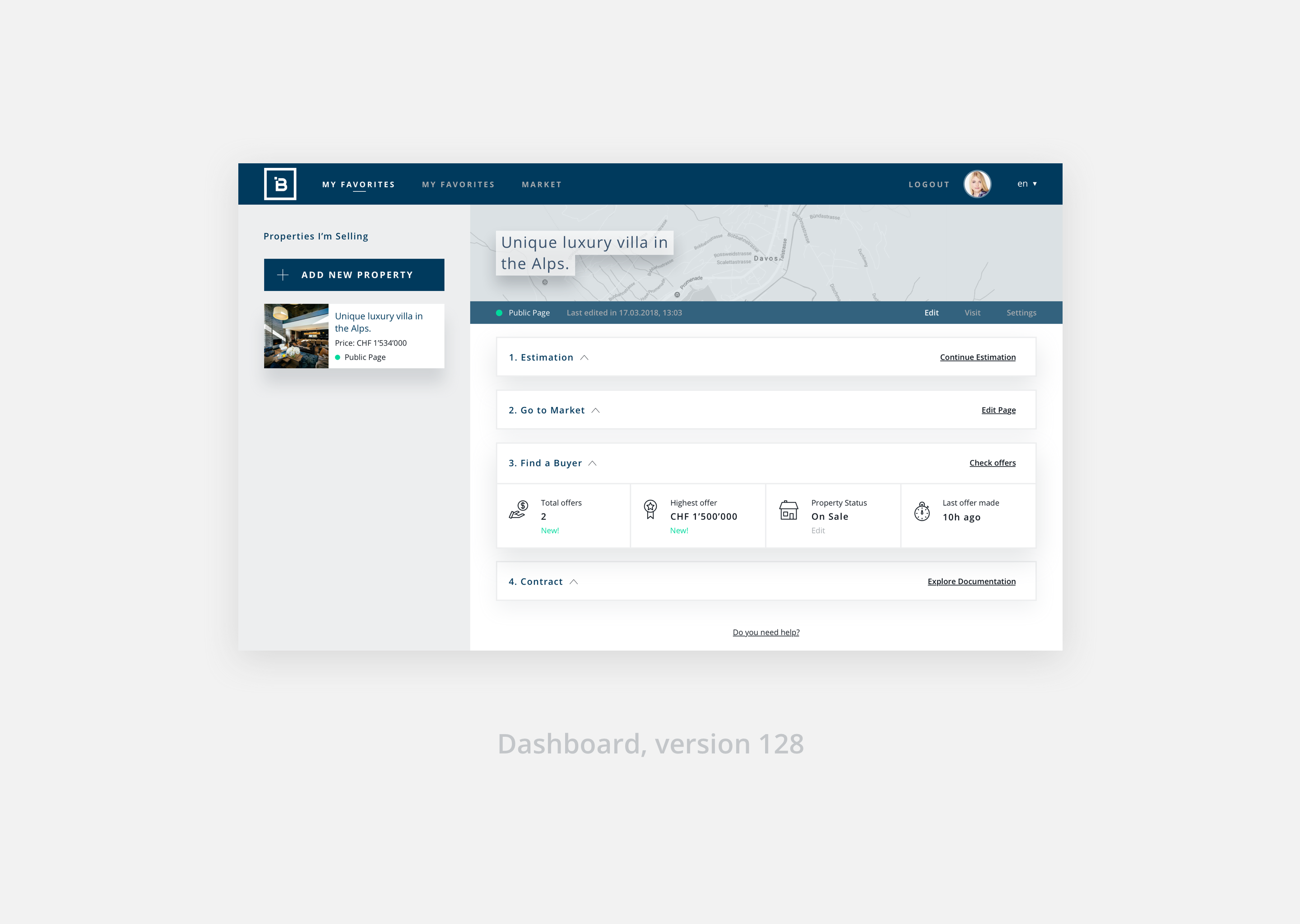
From a page builder to a page manager, Brixel’s dashboard evolved to respond to needs quite different from the original ones.
With the added features and constant product evolution, navigation started to show its weaknesses and it quickly became a heavy painpoint to the user.
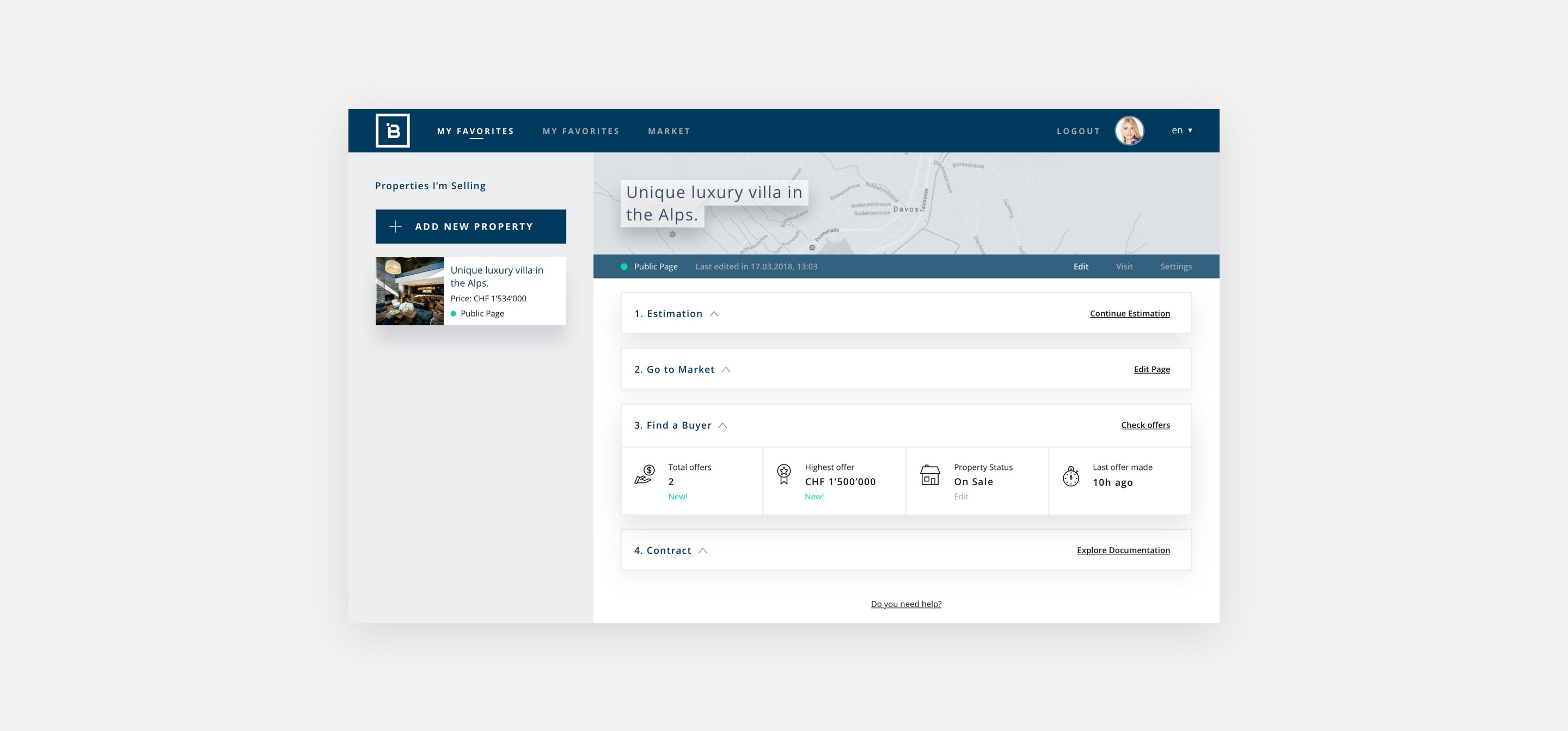
The first approach focused more on showing the page and main actions for editing, while the current one reflects new business needs and strategic decisions which helps keeping a more solid flow between onboarding and task completion.
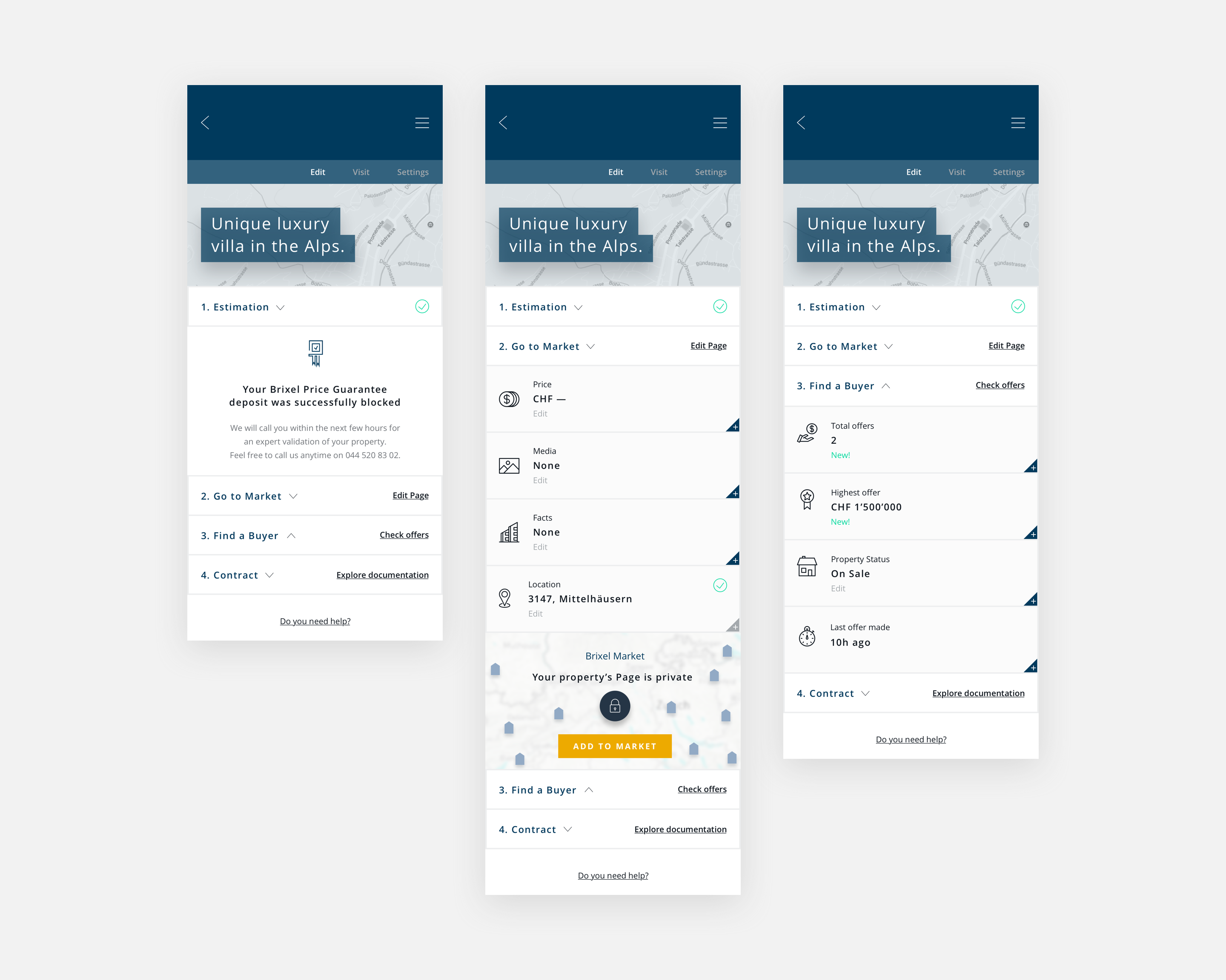
The user is guided through the next main actions and has a constant overview on the unfinished steps, from Property Estimation through to Contract.
From a page builder to a process oriented dashboard.
From the status of the page and Price Estimation based on the onboarding questions, to the editable sections of the Page in itself and offers being made on the property, Brixel lets the user have a full overview on the created property page and what is happening with it. It has been designed with a mobile first approach, considering fast page edition and quick on-the-go check-ups on offers.


